How to Style Divi Blurbs with a 3D Hover Effect
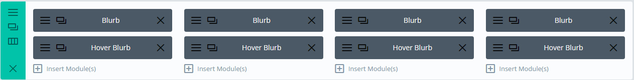
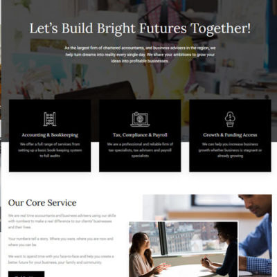
First we need to create a new section with 4 columns. Then we need to create 2 Blurbs. One for the front side and one for the back.
It should look like this
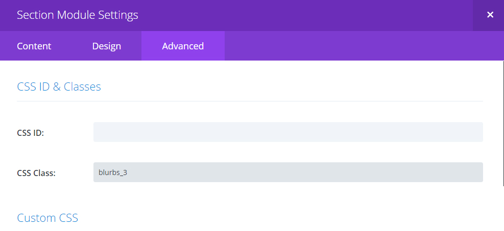
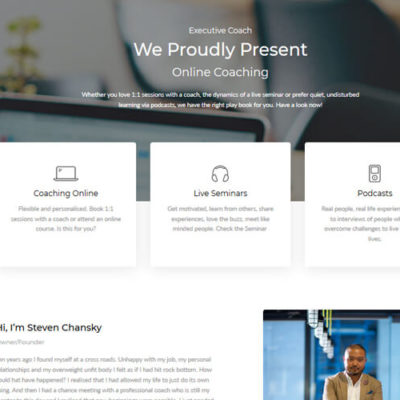
Then we need to add the class blurbs_3 to the section row.
It should look like this
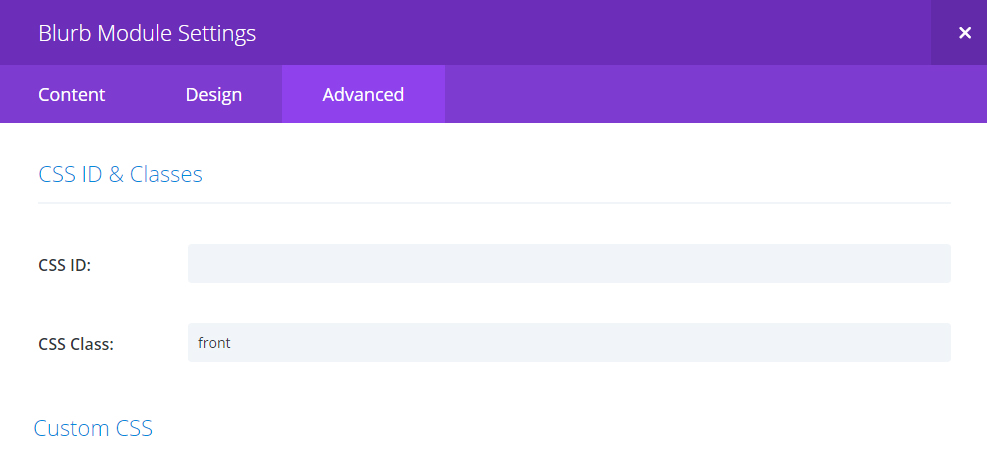
Add the class front in the Blurb Module. And we need to add the class back to the Blurb we are going to use in the hover.
It should look like this
Now in the first Blurb settings. Content > Add in your Text here. Choose your icon in the icon settings. In the design settings make sure you select white as the icon colour. Icon placement is top.
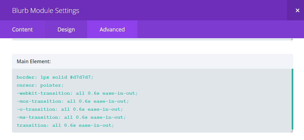
Now it gets interesting! In the Advanced Blurb Module setting we need to add 2 bits of code.
Main Element:
border: 1px solid #d7d7d7;
cursor: pointer;
-webkit-transition: all 0.6s ease-in-out;
-moz-transition: all 0.6s ease-in-out;
-o-transition: all 0.6s ease-in-out;
-ms-transition: all 0.6s ease-in-out;
transition: all 0.6s ease-in-out;
It should look like this
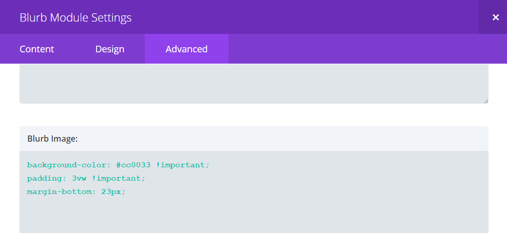
Second bit of code we need is this.
Blurb image:
background-color: #cc0033 !important;
padding: 3vw !important;
margin-bottom: 23px;
It should look like this
Now in the second Blurb settings. Content > Add in your Text here. We have ‘Find out more’ here. Again you will need to choose your icon in the icon settings. In the design settings make sure you select white as the icon colour. Icon placement is top.
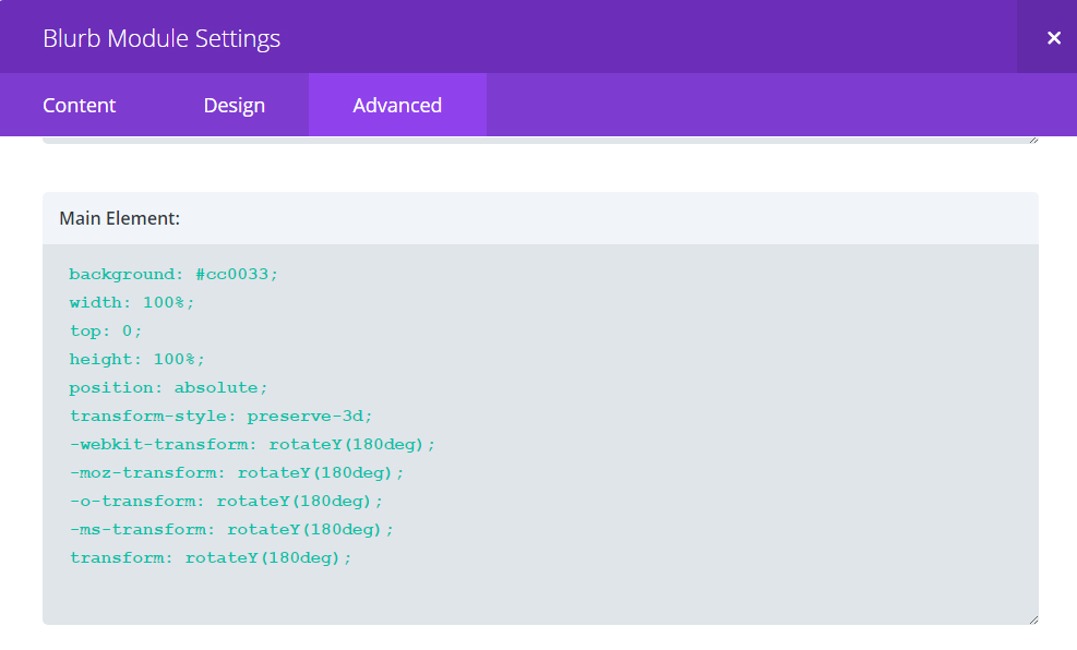
In the Advanced Blurb Module setting we need to add 3 bits of code.
Main Element:
background: #cc0033;
width: 100%;
top: 0;
height: 100%;
position: absolute;
transform-style: preserve-3d;
-webkit-transform: rotateY(180deg);
-moz-transform: rotateY(180deg);
-o-transform: rotateY(180deg);
-ms-transform: rotateY(180deg);
transform: rotateY(180deg);
It should look like this
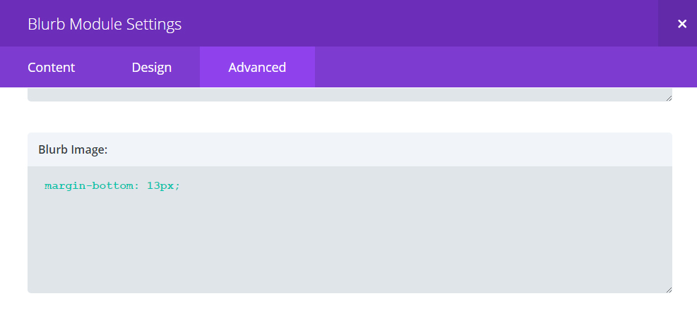
Second bit of code we need is this.
Blurb image:
margin-bottom: 13px;
It should look like this
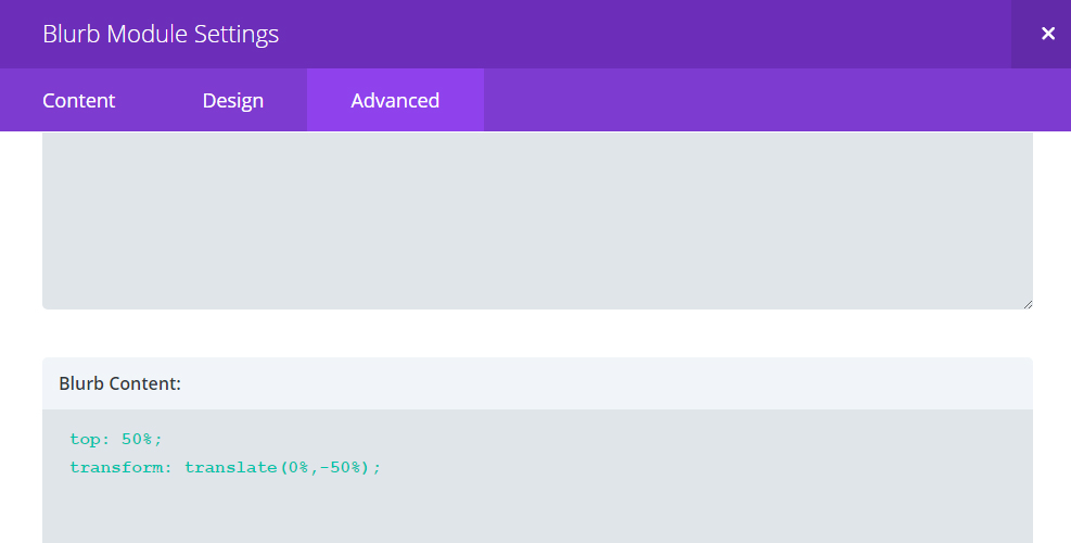
 Third bit of code we need is this.
Blurb content:
top: 50%;
transform: translate(0%,-50%);[/css]
It should look like this
The last step is to add in the CSS in your child theme or the Divi theme CSS box.
The css:
.blurbs_3 .et_pb_column_4_4 h2:after{
content: “”;
display: block;
width: 131px;
height: 1px;
background-color: #d7d7d7;
margin: 20px auto 36px;
}
.blurbs_3 .et_pb_column_1_4 .et-pb-icon{
font-size: 60px !important;
}
.blurbs_3 .et_pb_column_1_4 .et_pb_blurb_container{
padding: 0 17px 24px;
line-height: 168%;
}
.blurbs_3 .et_pb_column_1_4{
cursor: pointer;
}
.blurbs_3 .et_pb_column_1_4 .back .et-pb-icon:after{
content: “”;
display: block;
width: 0;
height: 1px;
background-color: #fff;
margin: 0 auto;
-webkit-transition: all 0.9s linear;
-moz-transition: all 0.9s linear;
-o-transition: all 0.9s linear;
-ms-transition: all 0.9s linear;
transition: all 0.9s linear;
}
.blurbs_3 .et_pb_column_1_4 .back .et-pb-icon{
font-size: 120px !important;
/*border-bottom: 1px solid !important;*/
line-height: 90%;
}
.blurbs_3 .et_pb_column_1_4:hover .back .et-pb-icon:after{
width: 100%;
}
.blurbs_3 .et_pb_column_1_4{
-webkit-transition: all 0.4s ease-in-out;
-moz-transition: all 0.4s ease-in-out;
-o-transition: all 0.4s ease-in-out;
-ms-transition: all 0.4s ease-in-out;
transition: all 0.4s ease-in-out;
-webkit-perspective: 800px;
-moz-perspective: 800px;
-o-perspective: 800px;
-ms-perspective: 800px;
perspective: 800px;
}
.blurbs_3 .et_pb_column_1_4 .et_pb_blurb{
background-position: center center;
-webkit-transition: all 0.4s linear;
-moz-transition: all 0.4s linear;
-o-transition: all 0.4s linear;
-ms-transition: all 0.4s linear;
transition: all 0.4s linear;
}
.blurbs_3 .et_pb_column_1_4 .et_pb_blurb.back{
opacity: 0;
}
.blurbs_3 .et_pb_column_1_4 .et_pb_blurb.front{
opacity: 1;
}
.blurbs_3 .et_pb_column_1_4:hover .et_pb_blurb.back{
-webkit-transform: rotateY(0deg);
-moz-transform: rotateY(0deg);
-o-transform: rotateY(0deg);
-ms-transform: rotateY(0deg);
transform: rotateY(0deg);
/*transform-style: preserve-3d;*/
opacity: 1;
}
.blurbs_3 .et_pb_column_1_4:hover .et_pb_blurb.front{
-webkit-transform: rotateY(-180deg);
-moz-transform: rotateY(-180deg);
-o-transform: rotateY(-180deg);
-ms-transform: rotateY(-180deg);
transform: rotateY(-180deg);
/*transform-style: preserve-3d;*/
opacity: 0;
}
/*Responsive*/
@media only screen and (max-width: 980px) {
.blurbs_3 .et_pb_row{
overflow: visible;
}
.blurbs_3 .et_pb_column_1_4 .et_pb_blurb{
max-width: 226px;
margin: 0 auto !important;
left: 0;
right: 0;
}
}
@media only screen and (max-width: 480px) {
.blurbs_3 .et_pb_column_1_4 .et_pb_main_blurb_image {
background-color: #cc0033 !important;
padding: 40px !important;
margin-bottom: 23px;
}
}
For more Blurb effects check out our Premium Blurbs UI KIt here Or download this free Divi Layout Pack Here