How to build a responsive website with the Divi theme
Building a responsive website is an important task for anyone looking to establish an online presence. The Divi theme is a powerful tool that simplifies this process. This post will guide web designers through the steps necessary to create a responsive website using Divi, ensuring it looks good on both desktop and mobile devices.
Introduction to the Divi theme
Introduction to the Divi theme
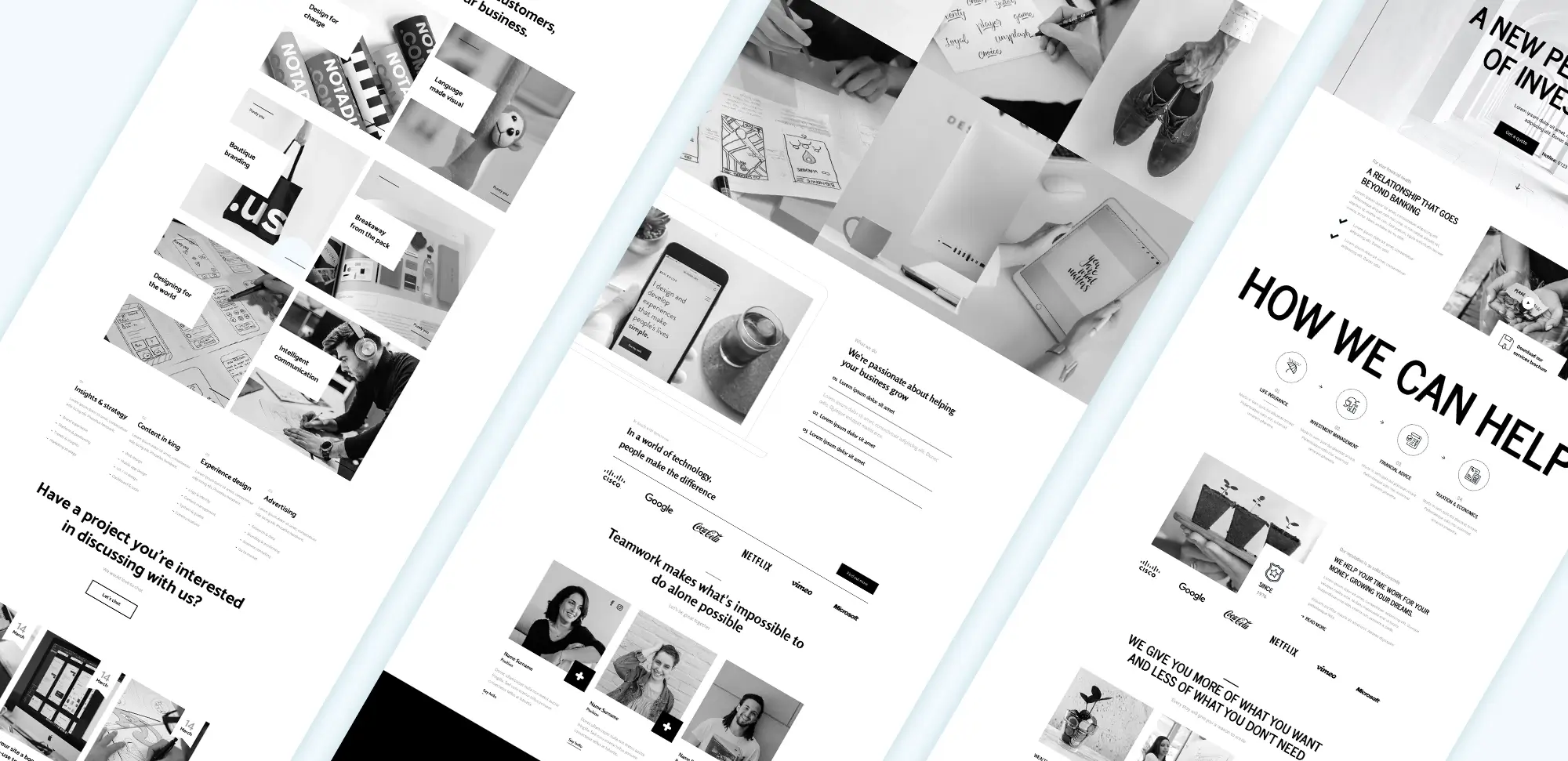
The Divi theme is a versatile WordPress theme developed by Elegant Themes. It is known for its user-friendly interface and a variety of features that cater to different types of websites. One of the main reasons web designers choose Divi is its flexibility, allowing for extensive customisation without needing to write any code.
The theme includes a visual page builder, which means designers can create layouts by simply dragging and dropping elements onto the page. This feature makes it accessible for beginners while still offering enough depth for experienced developers. By using Divi, creators can design websites that are not only visually appealing but also responsive.
Importance of responsive design
Responsive design refers to the ability of a website to adapt its layout and content based on the screen size of the device being used. This approach is essential in today’s digital environment, where many people access websites on mobile devices. A responsive design improves the visitor’s experience by ensuring that the content is easy to read and navigate, regardless of the device.
Web designers should consider responsive design as a fundamental principle when building websites. Not only does it enhance visitor satisfaction, but it also positively impacts search engine rankings. Search engines favour websites that provide a good experience on all devices, making responsive design a smart choice for anyone looking to boost their online visibility.
Setting up the Divi theme
Setting up the Divi theme
To begin building a responsive website with Divi, the first step is to install the theme. This involves purchasing Divi from the Elegant Themes website and downloading the theme files. Once downloaded, the next step is to install Divi on the WordPress dashboard by navigating to the themes section and uploading the downloaded files.
After activating the theme, the initial configuration involves adjusting the basic settings. This can include setting the site title, uploading a logo, and selecting colour schemes. Divi offers a variety of demo content that can be imported to help designers get started quickly. This demo content provides a solid foundation, allowing creators to customise and build upon it.
Navigating the Divi dashboard is straightforward. The dashboard includes the Divi Builder, where designers can start creating their pages. Understanding how to use the main sections of the builder will enable creators to take full advantage of Divi’s features.
Using Divi Builder for responsive design
Using Divi Builder for responsive design
Divi Builder is the heart of the Divi theme, allowing for easy creation and editing of web pages. The builder includes a range of modules, such as text, images, buttons, and galleries, which can be added to pages with just a few clicks. Each module is highly customisable, allowing web designers to adjust styles, sizes, and layouts as needed.
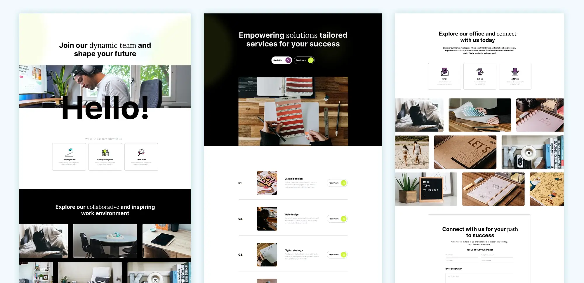
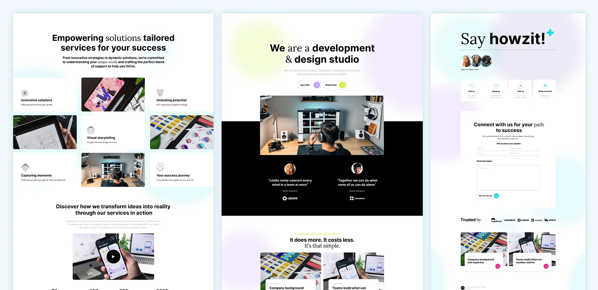
Creating responsive layouts begins by selecting pre-designed layouts from the Divi library. These layouts are designed to be mobile-friendly from the start, making it easier for designers to create a responsive site. Once a layout is selected, designers can customise it to fit their needs, including rearranging modules and adding new content.
Web designers can build flexible grids using rows and columns, allowing content to adapt to different screen sizes. This means that as the screen size changes, the content adjusts accordingly, ensuring a consistent look and feel across devices. Divi’s responsive editing features make it easy to tweak designs for mobile or tablet views, allowing for precise adjustments.
After creating custom layouts, designers can save them for future use. This feature not only saves time but also helps maintain consistency across multiple pages.
Customising modules for responsiveness
Customising modules for responsiveness
One of the strengths of the Divi theme is its modular approach to design. Each element on a page is contained within a module, making it easy for web designers to adjust settings individually. For text modules, designers can adjust font sizes to suit different devices, ensuring readability regardless of screen size. This flexibility is important, as what works well on a desktop may not translate effectively to mobile.
Image modules also require careful consideration. Designers should optimise images for mobile use by selecting appropriate dimensions and file sizes. This can help improve load times and maintain visual quality. Divi allows creators to add image overlays and effects, enhancing the overall design while ensuring that images display correctly on all devices.
Button modules are another important aspect of responsive design. Designers should focus on making buttons touch-friendly, which involves adjusting their sizes and spacing for mobile users. Setting hover effects can add an interactive element, encouraging visitors to click. It’s essential that buttons remain easily accessible across all devices.
Other modules, such as video, slider, and gallery modules, also need to be optimised for responsiveness. This includes ensuring that videos are viewable on mobile and that sliders adjust their size based on the screen. By paying attention to these details, web designers can create a seamless experience for visitors, no matter how they access the site.
Mobile design adjustments
Mobile design adjustments
When working with Divi, it’s crucial to make mobile design adjustments to ensure the website looks great on smaller screens. Responsive settings can be enabled in Divi to allow for customisation based on device type. This means that certain elements can be hidden or shown depending on whether the visitor is on a desktop, tablet, or mobile device.
Creating mobile-friendly menus is an important aspect of mobile design. Designers should consider implementing hamburger menus, which save space and make navigation easier on small screens. Testing menu functionality across devices is vital to ensure visitors can easily find what they need.
Adjusting layouts for mobile is another essential step. Designers can stack columns vertically to make content more readable. Simplifying complex layouts for mobile users can enhance the overall experience. Maintaining readability is also key, and this can be achieved by ensuring that font sizes are appropriate for smaller screens.
Enhancing the mobile user experience involves improving touch interactions. Ensuring that clickable elements are appropriately sized will make it easier for visitors to navigate. Additionally, reducing load times on mobile devices will contribute to a smoother experience.
Testing and optimising responsiveness
Testing and optimising responsiveness
Once the responsive design has been implemented, testing is vital to ensure everything works as intended. Web designers should use various testing tools and methods to assess how the website performs on different devices. Browser developer tools can provide valuable insights into how elements adapt to varying screen sizes.
Identifying and fixing issues is a critical part of the testing process. Common responsive design problems, such as layout inconsistencies and image scaling issues, should be addressed promptly. Web designers should also ensure that font and text display problems are resolved before launching the site.
Performance optimisation is an ongoing task. Minimising CSS and JavaScript can significantly improve load times. Implementing caching strategies and optimising images will also contribute to better performance. Ensuring consistent design across devices is essential, and this involves maintaining visual consistency in elements like colours and fonts.
Performance optimisation
Performance optimisation
Performance optimisation is crucial for creating a responsive website that loads quickly and efficiently. Web designers should focus on speed optimisation techniques to improve the overall performance of a Divi website. This includes regularly checking and optimising site speed, implementing caching strategies, and choosing a reliable hosting provider.
Image optimisation plays a significant role in performance. Designers should compress images without sacrificing quality and select the appropriate formats for different types of images. Implementing lazy loading for images can further improve page loading times, allowing images to load only when they are visible to the visitor.
Minimising code bloat is another effective strategy. This involves removing unused CSS and JavaScript, which can slow down the website. Leveraging Divi’s built-in optimisation tools and using plugins for code minification can help streamline performance.
Enhancing server performance is equally important. Choosing a reliable hosting provider that can handle traffic demands is crucial for a successful website. Upgrading server resources as needed and implementing server-side caching can contribute to better performance, ensuring that the website remains fast and responsive.
SEO best practices
SEO best practices
Optimising for search engines is essential for improving visibility. Implementing on-page SEO strategies, such as using SEO-friendly URLs and optimising meta tags, can significantly impact search rankings. Web designers should leverage header tags effectively to structure content for SEO.
Integrating SEO plugins, like Yoast SEO, with Divi can enhance the website’s search engine performance. This allows designers to configure SEO settings directly within the theme, ensuring that content is optimised. Utilising schema markup can also improve visibility in search results.
Improving site visibility involves creating SEO-optimised content that resonates with the target audience. Building internal and external links will enhance credibility and encourage user engagement. Social media integration can drive traffic and boost the website’s reach.
Maintaining SEO standards is an ongoing effort. Regularly updating content, fixing broken links, and ensuring mobile-friendliness will support long-term SEO success. Staying informed about SEO best practices is crucial for keeping the website competitive.
Advanced techniques
Advanced techniques
For those looking to take their Divi website to the next level, advanced techniques can offer significant benefits. Custom CSS can be added to enhance responsiveness and tailor the website to specific needs. Targeting specific devices with media queries allows for greater control over design elements.
Integrating third-party plugins can expand the functionality of a Divi website. Plugins that work well with Divi can enhance features, such as adding e-commerce capabilities with WooCommerce or advanced contact forms for improved user interaction.
Creating custom modules tailored to specific needs can further personalise the website. Using Divi’s API allows for the development of bespoke modules that offer unique functionalities. Styling these custom modules ensures consistency across the website.
Utilising global settings and presets can streamline the design process. Setting global fonts and colours helps maintain uniformity, while creating design presets allows for quick adjustments across multiple pages. Managing global modules efficiently contributes to a smoother workflow for web designers.
Maintenance and updates
Maintenance and updates
Regular maintenance is vital for the ongoing success of a Divi website. Keeping the theme updated is important for compatibility and security. Designers should check for updates regularly and back up the website before applying any changes.
Creating regular backups protects the website from potential issues. Using backup plugins can simplify this process, ensuring that the site can be restored if needed. Automated backup solutions offer additional peace of mind.
Troubleshooting common issues is part of maintaining a website. Designers should know how to resolve responsive issues and fix loading problems in the Divi Builder. Addressing plugin conflicts quickly will prevent disruptions.
Maintaining website security involves implementing best practices. Regularly updating passwords and managing user roles will help keep the site secure. Monitoring the website for vulnerabilities is essential to protect against potential threats.
Resources and support

Resources and support
Learning resources are available for those wanting to deepen their knowledge of the Divi theme. The official documentation provides detailed guides and tutorials. Online tutorials and video courses are also helpful for visual learners. Engaging with blogs and forums dedicated to Divi can offer valuable insights and tips.
Accessing customer support is crucial when facing issues. Divi provides a support system for users needing assistance. Participating in community forums allows designers to share experiences and seek advice from peers. Joining Divi user groups can foster connections and provide support.
Utilising pre-designed layouts can save time and effort when building a website. Customising these layouts for specific needs helps create a unique site while benefiting from a solid foundation. Sharing and downloading Divi templates fosters collaboration and creativity within the community.
Staying updated with Divi involves following announcements from Elegant Themes and subscribing to newsletters. Attending webinars and live sessions offers additional learning opportunities, while engaging with Divi’s social media channels keeps designers informed of the latest trends and updates.
Conclusion and best practices

Conclusion and best practices
Building a responsive website with the Divi theme involves several important steps. By following best practices, web designers can create sites that are visually appealing and functional across devices. This post has highlighted key points, including the importance of responsive design, the benefits of using Divi, and the techniques necessary for successful implementation.
Web designers should always prioritise mobile-first design, keeping layouts simple and user-friendly. Regularly updating content and monitoring website performance will ensure ongoing success. Gathering visitor feedback is also essential for making improvements.
Finally, encouraging continuous learning will help designers stay ahead in the ever-changing world of web design. By exploring advanced features and engaging with the Divi community, designers can develop their skills and create outstanding websites.
Glossary

Glossary
Divi Theme
A premium WordPress theme and page builder from Elegant Themes. Divi is known for its drag-and-drop interface, offering complete customisation through a visual editor. It comes with hundreds of pre-made layouts and is suited for users looking to create highly customised designs without coding.
MaxiBlocks
An open-source block-based page builder designed to work within WordPress’s Gutenberg editor. MaxiBlocks offers pre-designed block patterns and templates, making it easier to customise sites while maintaining fast load speeds. MaxiBlocks fully supports WordPress’s Full Site Editing (FSE), providing flexibility for future updates.
WordPress Themes
Pre-built templates that define a website’s layout and design. WordPress themes control everything from typography to page structure and are available in free and premium versions. Many themes work with page builders like Divi or Gutenberg, while some are designed specifically for one builder.
WordPress Plugins
Add-ons that enhance a WordPress website’s functionality. Plugins can be used to add features like SEO tools, e-commerce platforms, and contact forms. WordPress has a vast repository of free and premium plugins, allowing users to customise their sites.
WordPress Website Builder
A tool, like Divi or MaxiBlocks, that allows users to create and design websites without coding. Builders typically provide drag-and-drop functionality, allowing users to easily customise site layouts. L
WordPress Developer
A technical professional who builds and customises WordPress websites using code. Developers are responsible for adding advanced features, improving site performance, and ensuring compatibility with plugins and themes.
WordPress Designer
A creative professional who focuses on the visual layout, typography, and overall aesthetics of a WordPress website. Designers often work with page builders to create user-friendly and visually appealing websites.
Full Site Editing (FSE)
A WordPress feature that allows users to fully customise all areas of a site, including headers, footers, and page layouts, directly through Gutenberg blocks. MaxiBlocks is fully compatible with FSE, giving users the freedom to control every aspect of their website without needing external plugins or custom coding.
Drag-and-Drop Builder
A type of website builder that allows users to create layouts by dragging elements like text, images, and buttons onto a page. Divi and MaxiBlocks are examples of drag-and-drop builders, making it easy for users to customise their sites without needing technical skills.
Different Types of WordPress Websites
– Blogs: Focused on sharing written content, ideal for personal blogs or news sites.
– E-commerce Sites: Built with plugins like WooCommerce to sell products or services online.
– Portfolio Websites: Designed to showcase creative work such as photography, writing, or design.
– Corporate Websites: Used by businesses to showcase services, company information, and contact details.
– Membership Websites: Offer exclusive content, services, or products to users who sign up or pay for membership.
– Educational Websites: Built for online learning, integrating courses and managing students.
– Non-profit Websites: Used by charities or organisations to promote causes, collect donations, and share news.
Importance of responsive design
FAQs
1. Which is better: Divi or MaxiBlocks?
Both builders offer strong customisation options, but they serve different user needs:
- Divi is ideal for users who want advanced design flexibility and a highly visual interface. Divi operates independently of the WordPress block editor and offers numerous pre-made layouts, but it may be heavier on site performance.
- MaxiBlocks integrates seamlessly with Gutenberg and focuses on block-based design, making it lightweight and fast. It’s best suited for users who prefer working within WordPress’s native block editor and want to future-proof their site for Full Site Editing.
2. What types of websites can I build with Divi, MaxiBlocks, or other WordPress themes?
All these tools allow you to build a wide range of websites:
- Blog Websites for content creators.
- E-commerce Websites using plugins like WooCommerce.
- Portfolio Websites to display creative work.
- Corporate Websites to present services and company information.
- Educational Websites for offering courses.
3. How does Full Site Editing work with MaxiBlocks?
Full Site Editing (FSE) allows users to fully customise all areas of a site, including headers, footers, and page layouts, directly through Gutenberg blocks. MaxiBlocks is fully compatible with FSE, giving users the freedom to control every aspect of their website without needing external plugins or custom coding.
4. What’s the performance difference between Divi and MaxiBlocks?
- Divi is rich in features but can be resource-intensive, which may slow down website load times unless properly optimised with caching plugins and performance enhancements.
- MaxiBlocks, being a lightweight block-based builder, is generally faster and more optimised for performance, especially when using block themes that are designed for speed.
5. How much does it cost to design a website using Divi or MaxiBlocks?
- Divi is a premium theme with annual or lifetime pricing options. The cost covers access to all Divi products, including its builder and theme.
- MaxiBlocks is free and open-source, though premium templates and add-ons may be available for purchase.
6. Can I use free themes with MaxiBlocks?
Yes, MaxiBlocks works seamlessly with free WordPress block themes. It integrates directly with Gutenberg, allowing you to design custom layouts using pre-built block patterns.
7. What are the advantages of using a block-based builder like MaxiBlocks compared to a visual builder like Divi?
- MaxiBlocks is fully compatible with the native WordPress block editor and is optimised for performance, making it a future-proof choice as WordPress continues to evolve toward Full Site Editing.
- Divi, while powerful and visually rich, operates independently of the Gutenberg editor and may not fully embrace the block-based future of WordPress.
8. What kinds of WordPress website builders are available?
- Visual Builders like Divi and Elementor provide drag-and-drop functionality with their own visual editing interfaces.
- Block Builders like MaxiBlocks integrate directly with WordPress’s native Gutenberg editor, providing a lightweight, future-proof approach to building websites.
Learn more: About MaxiBlocks.

