Mastering WordPress Navigation Menus: A Comprehensive Guide to Building User-Friendly Menus
Meta Description: Craft user-friendly and visually appealing navigation menus in WordPress. Explore menu creation, customization, responsiveness, accessibility, and best practices for optimal website navigation.

WordPress Navigation Menus: A Guide
Introduction
Navigation menus are essential elements of any website, playing a crucial role in user experience (UX) and usability. They act as a roadmap, guiding visitors to the information they seek and enabling them to explore your site efficiently.
Importance
Effective navigation menus are vital for several reasons:
- Enhanced UX: Clear and intuitive navigation menus make it easy for visitors to find what they need, leading to a more positive experience and increased engagement.
- Improved usability: A well-structured menu allows users to navigate your site effortlessly, reducing frustration and ensuring they can access all relevant content.
- Boosted SEO: Search engines consider website structure and navigation when ranking websites. A logical and well-organized menu can indirectly contribute to better SEO.
Functionality in WordPress
WordPress offers a user-friendly interface for creating and managing navigation menus. Here’s an overview of its functionalities:
- Menu creation and editing: You can easily create new menus, add menu items (pages, posts, categories, etc.), and customize their appearance (labels, order, etc.).
- Multiple menu locations: WordPress themes often have designated locations (header, footer, sidebar) where you can assign different menus for display.
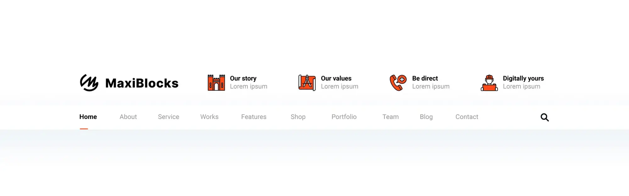
Building Your Website’s Roadmap: Creating a Basic Navigation Menu in WordPress
A well-organized navigation menu acts as a roadmap for your website visitors, guiding them to the information they seek.
- Finding the Menu Editor:
- Log in to your WordPress dashboard.
- Navigate to “Appearance” in the left-hand menu.
- Select “Menus” from the submenu.
Here, you’ll see an overview of existing menus or the option to create a new one.
2. Building Your Menu:
- Create a New Menu: Click “Create a New Menu” and give your menu a descriptive name (e.g., “Main Navigation Menu”).
- Select Menu Items: In the “Add menu items” section, choose the elements you want to include in your menu:
- Pages: Select the pages you’ve already created on your website.
- Categories: Add categories associated with your posts for easy navigation by topic.
- Custom Links: Include external links to relevant websites or internal links to specific sections of your site that aren’t pages.
- Drag and Drop to Organize: Once you’ve added items, use the drag-and-drop functionality to arrange them in the desired order of appearance on your menu.
3. Defining Menu Structure (Optional):
For more complex menus, you can create a hierarchical structure using submenus:
- Create Submenus: Drag and drop menu items slightly to the right, creating an indent. This indicates that they become sub-items of the item above them.
- Utilize Parent and Child Items: The indented items become “child items” of the “parent item” above them. This creates a dropdown menu when users hover over the parent item.
4. Assigning Menu Locations:
Once your menu is structured, tell WordPress where you want it to display:
- Choose Location: Scroll down to the “Menu Settings” section and check the box next to your desired location (e.g., “Primary Menu”).
- Save Menu: Click the “Save Menu” button to finalize your changes.
Building Hierarchical Menus: Adding and Managing Submenus in WordPress
WordPress allows you to create structured navigation menus using submenus, also known as dropdown menus. These menus enhance user experience by providing a clear organization of your website’s content and allowing users to navigate to more specific sections within a main category.
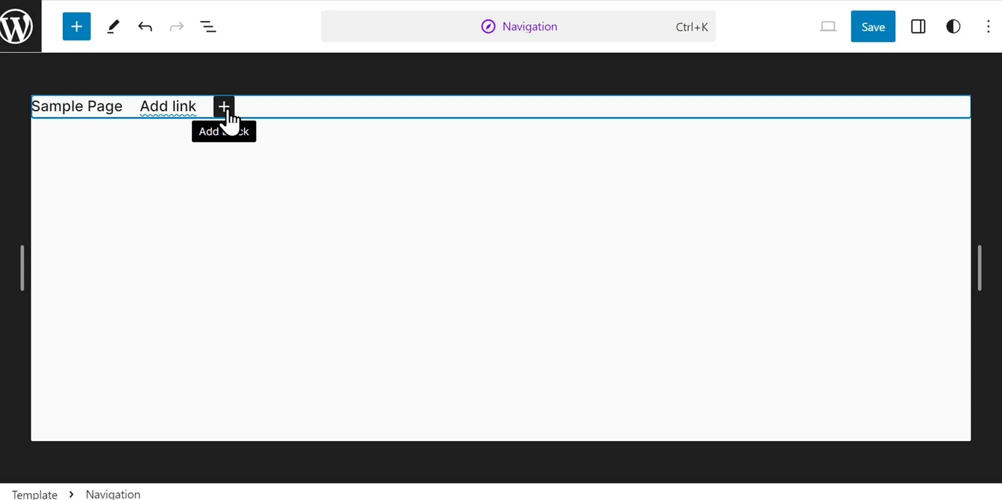
1. Creating Submenus:
- Drag and Drop Indentation: In the menu editor, select the item you want to become a submenu and drag it slightly to the right, creating an indent. This visually indicates that it becomes a sub-item of the item directly above it.
- Parent and Child Relationship: The indented item becomes a “child item” of the “parent item” above it. Hovering over the parent item will now display the child item(s) as a dropdown menu.
2. Organizing Submenu Items:
Once you’ve created submenus, you can further organize their order within the dropdown:
- Drag and Drop Within Submenu: Use drag-and-drop functionality to arrange submenu items in the desired order they will appear when the dropdown opens.
- Nested Submenus (Optional): For even more complex structures, you can create nested submenus by indenting submenu items further to the right, creating child items within child items.
Fine-Tuning Your WordPress Menus: Advanced Features and Best Practices
While creating a basic navigation menu is straightforward, WordPress offers a variety of advanced features and best practices to take your menus to the next level, ensuring a seamless user experience across different devices and catering to diverse user needs.
1. Prioritizing Mobile Responsiveness:
In today’s mobile-first world, ensuring your menu functions flawlessly on all devices, especially smaller screens, is crucial. Here are some tips:
- Choose a Responsive Theme: Select a WordPress theme specifically designed to adapt layouts and menus for optimal viewing on various screen sizes.
- Utilize Responsive Menu Plugins: Explore plugins that add responsive features to existing menus, often enabling collapsing menus or hamburger icons for mobile devices.
- Test Thoroughly: Test your website across different devices (laptops, tablets, smartphones) to identify and address any potential responsiveness issues with your menu.
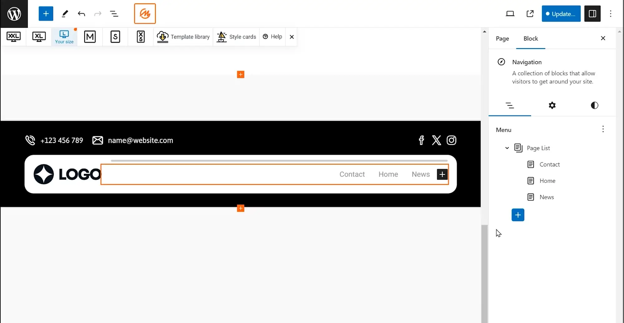
2. Integrating Menus with Gutenberg Editor:
The Gutenberg editor, WordPress’s modern editing experience, offers dedicated blocks for adding and managing menus. This simplifies the process and allows you to visually integrate your menu within your page content.
- Search for “Navigation” Block: Within the Gutenberg editor, search for the “Navigation” block and insert it into your desired page location.
- Select Existing Menu: Choose the menu you want to display from the list of menus you’ve already created.
- Style and Customize (Optional): While limited compared to theme customization or CSS, the block editor offers some basic styling options for your menu.
3. Exploring Advanced Menu Features (Optional):
For websites with complex structures, consider these advanced menu features:
- Mega Menus: These expansive menus offer a grid-like layout, displaying subcategories and additional content within the dropdown, ideal for websites with a vast amount of information.
- Sticky Menus: These menus remain fixed at the top of the screen as users scroll down the page, providing continuous navigation access.
Implementing these features often requires additional plugins or custom coding, so weigh the complexity against your website’s specific needs and technical expertise.
4. Accessibility and Best Practices:
Ensuring your website, including the navigation menu, is accessible to all users, regardless of their abilities, is crucial. Here are some key points:
- Clear and Concise Labeling: Use clear and descriptive labels for menu items to aid user understanding.
- Keyboard Navigation: Ensure your menu can be navigated using only the keyboard, catering to users who might not be able to use a mouse.
- Screen Reader Compatibility: Make sure your menu is compatible with screen readers used by visually impaired users.
Following these accessibility best practices allows you to create inclusive menus that cater to all visitors.
5. Common Pitfalls to Avoid:
While building your menus, be mindful of these common pitfalls:
- Overly Complex Structures: Strive for a clear and concise menu structure. Avoid excessive submenus that might overwhelm users.
- Inconsistent Branding: Ensure your menu’s design aligns with your website’s overall branding, maintaining visual consistency.
- Limited Mobile Usability: Prioritize mobile responsiveness to prevent frustrating user experiences on smaller devices.
By understanding and implementing these advanced features and best practices, you can transform your WordPress menus into powerful navigation tools that enhance user experience, accessibility, and the overall look and feel of your website.