9 Must read tips to ignite your website design inspiration
Table of contents
- Pre-production and wireframes for website design
- Why is responsive design so important?
- What is Website Accessibility?
- Tools to help website designers
- Libraries of premade website parts
- Full Site Editing and Drag-and-Drop Features
- Video and Images for website designs
- The importance of SEO
- Buying a domain name and hosting
- Final thoughts
Key Takeaways
- Pre-production planning: Many new web designers skip planning, causing delays and unexpected issues. It’s key to know the website’s purpose, what info to share, and the visitor’s next steps you want them to take..
- Responsive designs: often a much neglected part of web design. Web sites are viewed on a range of screens. Most often on smartphones nowadays. But websites are made on standard or larger laptop or desktop computer screens.
- Accessibility: where there is hesitation the law has to take over. Web designers ignored the fact that many people are differently abled whether due to birth, accident, war injuries or aging. Now the law has stepped in to punish website owners whose websites are not inclusive. Be aware of that.
- CMS, page builders, and themes: there are many tools available now to help new web designers get up and running quickly. It’s not even necessary anymore to be a coder or a designer. Tools are there to help both.
- Pre-made designs: being able to dip into libraries of pre-designed and pre-made parts of a website means web designers can assemble a website in no time at all without needing to know how to design or how to code.
Introduction to website design inspiration
Website design might seem tricky at first, but it’s really about creating a space on the internet that’s easy to use and well designed, where people can find information, products, services, or entertainment. Getting to grips with the basics is a great starting point. Starting with pre-production planning, to choosing content like text and images to picking colours and fonts, each part works together to make a website look good and work smoothly. Website design is as much about how it looks as how it functions behind the scenes, ensuring it’s simple for users to navigate.
This beginner’s guide gives a some idea of what website design involves. It covers the importance of planning ahead, making sure the design works across devices, and keeping the site accessible and SEO-friendly. There’s also the more technical side, like picking a CMS, page builder, or theme, as well as sorting out hosting and buying a domain name. Whether building a personal blog or a small business website, understanding these basics will help when considering website design.
Step-by-step guide on applying Gutenberg block styles
1. Pre-production and wireframes for website design
The importance of pre-production planning
Many web designers, especially when starting off, tend to think that web design is about throwing some designs together and picking colours and images. Pre-production planning isn’t really necessary. This most often leads to a website taking twice as long, if not more, to complete as planning that comes at the end tends to expose a bunch of unanticipated problems. It’s necessary to decide on the purpose of the website, the info that needs to be shared and identify what actions a visitor should take. This could be to get information, sign up for a newsletter, contact the business or buy a product.
Pre-production planning is an important part of the website design process because it lays the groundwork for a successful project. More careful planning in advance, as tedious as it might seem, will save much headache later on. Of course it’s more exciting to imagine designs and get creative. But without a plan for what the website needs to deliver on, the design work could be totally off target and at the worst case sentence the website to the internet graveyard of unloved and unused websites. There are millions of those.
Planning during the pre-production phase might also help in avoiding potential problems. It could be that the website might need to have an online store eventually. Or there could be a membership option if the business might want to offer courses to their users. For example, if there’s a chance the website will need a shop in the future, it’s worth looking into services that make adding things like payment options easier. WordPress is a popular Content Management System (CMS) that’s free to use because it’s open source. It’s a flexible option that allows the website to grow as the business expands. With nearly 60,000 free plugins available in the WordPress library, it’s simple to add features for anything from a membership site to a fully functioning online shop.
For anyone thinking about starting a web design agency in the future, including a pre-planning phase when working with clients is crucial. A detailed project flow chart and written proposal help outline the tasks for both the client and designer, set clear expectations, and make it easier to manage “feature creep,” which can be a challenge for all web designers. When pre-production planning is done properly, the design process runs more smoothly and often leads to much better results.
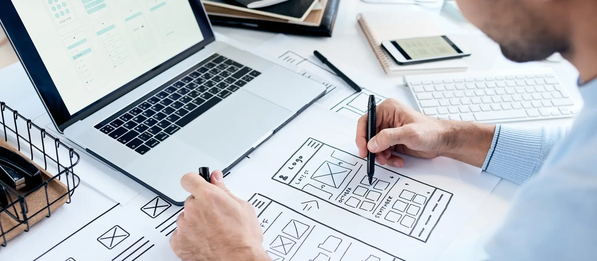
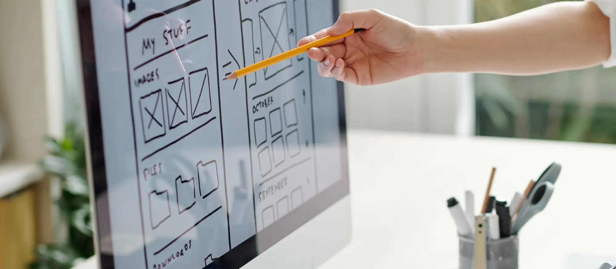
What are wireframes?
Creating a wireframe is part of the project planning stage. A wireframe can be as simple as a sketch on paper or on a digital notebook like reMarkable. For larger projects, using a tool like Balsamiq might be more practical. A basic wireframe should outline the homepage and show links to internal pages, including any cross-links that help users navigate easily. Since only the main menu items are visible at this stage, planning the site’s navigation in advance is important. For more complex websites, specialised wireframes may be needed, often involving UI/UX development experts.
Wireframes are important to website designs by providing a basic blueprint of the site’s structure and layout. These basic sketches should outline the positioning of elements on each page, helping designers and clients to be able to imagine the website’s flow and how it could work before any designs are created. Wireframes need to focus on the site’s navigation so that the user is led through the site in such a way as to serve its purpose. By mapping out the website’s skeleton, designers can find any issues early on, saving time in the later stages of the website’s development.
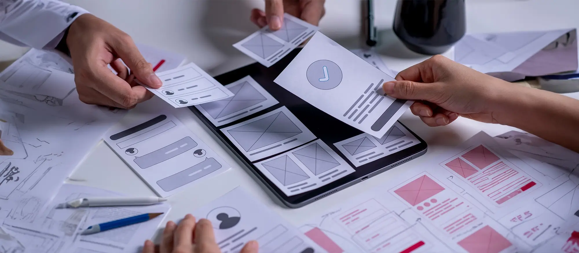
Website wireframes
2. Why is responsive design so important?
Responsive design is all about making sure a website looks good and works well on any device, whether it’s a smartphone, tablet, desktop, or even a big TV screen. This means that the website adjusts itself to fit the size of the screen. Images should resize automatically, text should be easy to read, and buttons or menus should be simple to use, especially on touchscreens. It’s not just about how the site looks; it’s also about making it easy for visitors to find what they need and interact with the site, no matter where they are. With so many people using different devices at home, at work, or while out and about, having a responsive website is a must.
Why Mobile-Friendly Matters
Most people expect to get information quickly and easily on their phones. If a website isn’t responsive, it could lose visitors. If users have to zoom in to read text or if buttons are too small to click, they’ll likely get frustrated and leave. Plus, how a site performs on mobile can affect its ranking on search engines. Google and others now favour websites that are mobile-friendly. A well-designed responsive site not only makes it easier for users but also helps the site show up better in search results. It’s all about keeping up with how people use the internet today.
Mobile-First Approach
The mobile-first approach means designing websites for smaller screens, especially smartphones, before adapting them for larger devices. Since so many people use their phones to browse the internet, it makes sense to focus on how the site will work on a mobile device first. This approach helps designers figure out what’s most important, keeping things simple and concentrating on the essential content and features. By starting with mobile, designers can tackle potential issues early on, like limited screen space and slower load times, ensuring the site looks good and functions well in those conditions.
Once the mobile version is approved, the design can be expanded and improved for larger screens like desktops and tablets. This is much easier than trying to shrink a complicated desktop layout down to fit a phone. Not only does the mobile-first approach create a better experience for users on smaller devices, but it also helps with search engine rankings, as they tend to favour mobile-friendly sites. In short, thinking about mobile users from the beginning leads to a website that is faster, more streamlined, and ready for smartphone users.
3. What is Website Accessibility?
Website accessibility is about making sure everyone can use a website, including differently-abled people. It’s all about giving all users a fair chance to enjoy and use the content, whether they’re using touch, voice, or keyboard. For example, someone who can’t see well might use a screen reader, while others might need to use keyboard shortcuts. If a website isn’t built with these needs in mind, it could shut out a lot of potential users, which isn’t fair and limits who can use the site.

How to make website accessibility-ready?
Accessibility also affects how easily people can find and use information, no matter what their abilities are. This means using text sizes that are easy to read, making sure colours stand out from each other, and adding text descriptions to images for people who can’t see them. It’s not just about being nice – it can also help a website show up better in search results and might even be required by law in some countries. In the end, an accessible website is easier for everyone to use, which makes for a better experience for all visitors.
What is ARIA?
ARIA, which stands for Accessible Rich Internet Applications, is a set of tools that helps make websites easier to use for differently-abled people. It works by adding extra info to parts of a website that might be tricky for things like screen readers to understand. For example, ARIA can label buttons, menus, or other bits you can click on, so that someone using a screen reader knows exactly what they do. Without ARIA, many of these parts might be hard to spot, making it tough for users to get around the site. By using ARIA, people who make websites can make sure that all visitors, no matter what they can or can’t do, have an easier time using the site. It’s really handy for making more complicated websites, with lots of stuff you can click on and interact with, easier to use for those who might otherwise struggle. But it’s important to use ARIA the right way; adding too much or using it in the wrong places can actually make things more confusing. When used well, ARIA can help make modern website features work better for everyone, making the internet a place where more people can join in.
Best practices for accessibility
Making an accessible website starts with choices that help everyone easily read and use the site. Picking the right fonts is important; using clear, easy-to-read fonts and making sure the text is big enough to read without zooming in is a simple but good way to make the site more accessible. Another big thing is contrast. Using colours that stand out from each other for the text and background makes content easier to see, especially for people who don’t see well. For example, dark text on a light background, or the other way around, is much easier to read than colours that look too similar. Keyboard navigation is also really important for accessibility.
Many differently-abled people use keyboards instead of a mouse to move around a website. This means the site should be set up so that all the bits you can click on, like links and buttons, can be easily used with just a keyboard. Simple things like adding focus indicators, which show where the user is on the page, can make a big difference. By thinking about these things – fonts, contrast, and keyboard navigation – people who make websites can create sites that work well for everyone, no matter what they can or can’t do.
It’s a pity that the law has had to step in to require website designs to serve differently-abled people. Of course not all countries have adopted this step but if the big ones such as the USA and the EU can lead by example it definitely helps.
4. Tools to help website designers
Picking a Content Management System (CMS)
Choosing the right CMS is one of the first big decisions when setting up a website. A CMS is the tool that organises and manages everything on a site, from words and pictures to pages and posts. WordPress is the most popular CMS by far, and for good reason. It’s easy to use, flexible, and has lots of add-ons and designs that make customising a site easier, even if you don’t know how to code.

Tips and tricks for maximizing creativity with free WordPress page builders
Whether building a simple blog or a big online shop, WordPress is often the top choice for both beginners and experienced developers. But WordPress isn’t the only option. For more complex needs or bigger projects, web designers might want to look at Drupal or Joomla. When picking a CMS, it’s important to think about how much control is needed, how easy the system is to use, and whether one needs any special features like tools for selling stuff online or blogging. The best choice will depend on what tbe function of the website is and how much technical know-how the team creating the website has.
Using Page Builders
Page builders with drag-and-drop features have made website design much simpler and more accessible for everyone. These tools allow users to create pages by simply dragging elements like text boxes, images, and buttons into place, without any need for coding. This means that even those who aren’t particularly tech-savvy can put together a professional-looking site much quicker than with traditional methods. By providing ready-made sections and templates, page builders speed up the process, making it easier to visualise and construct a website from the ground up.
Page builders also offer plenty of options for customisation, allowing users to adjust designs to suit their preferences. Elements can be easily moved around, fonts and colours can be changed, and layouts can be modified to fit the desired look and feel of the site. This gives users more control over the final appearance without the need to hire a developer. Tools like MaxiBlocks page builder and WordPress Gutenberg’s block editor are popular choices because they cater to both beginners and experienced users who want to experiment with design. Overall, drag-and-drop builders simplify the website creation process, transforming what was once a technical task into something more creative.
Customising Themes
Customising pre-designed themes is a straightforward way to use existing website designs when building a site. Pre-made themes offer a solid foundation with professionally crafted layouts, colours, and fonts, but they can be adjusted to fit a specific brand’s look and feel. This could mean adding a custom logo, changing the colour scheme to match brand guidelines, or selecting fonts that reflect the brand’s personality. Even with a ready-made structure, themes can be customised enough to give the website a unique touch while still looking polished and professional.
The flexibility of customising themes allows for changes to be made as needed without disrupting the overall design. Most themes come with options for rearranging elements, adding new features, or integrating extra functionality like e-commerce or social media links. This means the site can grow or adapt as the brand evolves, without needing a complete redesign. By using pre-designed themes, businesses can save time and money while still having the creative freedom to personalise the site, ensuring it stays in line with the brand’s goals and style.
5. Libraries of premade website parts
Benefits of Using Page Templates
Using page templates can really speed up the website design process by providing a ready-made structure for the site’s layout. Instead of starting from scratch, designers can choose a template that fits the website’s purpose and then add in the content, like text and images. This saves time because the basic design elements, such as headers, footers, and navigation, are already set up. Templates also help simplify the design phase, allowing designers to focus more on the content and less on the technical details of creating the layout.
Design libraries
Page templates also promote consistency across the website, which is key for achieving a professional look. By using the same template for different pages, the site can maintain a uniform layout and style throughout, making it easier for users to navigate. This consistency not only enhances the overall user experience but also strengthens the brand’s image by keeping design elements, like colours and fonts, the same from page to page. In this way, page templates make the design process quicker and more efficient while helping to create a cleaner, more organised site.
Incorporating Design Patterns
Incorporating design patterns into a website is a great way to improve user experience by using familiar layouts and structures. Design patterns are tried-and-tested solutions that help guide users through a website in a way that feels natural. These patterns include things like putting the navigation bar at the top, using a search bar in an easy-to-find spot, or placing the call-to-action buttons where users naturally look. By using these common design elements, users won’t have to waste time figuring out how to use the site, as they’ll already be familiar with how things are organised.
Another good thing about using design patterns is that they can reduce confusion or frustration, which can happen when a site is too complex or unusual. When websites follow recognisable patterns, users are more likely to stay interested and find what they’re looking for quickly. This not only makes the overall experience better but also encourages users to spend more time on the site. Using design patterns allows for a balance between creativity and practicality, making the website both easy to use and nice to look at without having to reinvent the wheel.
Using Blocks to Manage Content
Using blocks to manage content is a great way to organise and structure a website’s layout, making it easier to work with different types of content. Blocks let website designers split the site into manageable sections, like text, images, videos, and buttons, which can be easily moved, adjusted, or edited without messing up the overall design. This building-block approach not only makes it simpler to add new content but also helps to make everything fit neatly into the layout. It’s a straightforward way to keep the website looking tidy and professional while being flexible in how the content is shown.
Another good thing about using blocks is that it helps keep things consistent across the website. By working with pre-defined block structures, designers can make sure that similar content looks the same from page to page, creating a uniform experience for users. Blocks can also be customised to match the brand’s style, ensuring that even though the structure is consistent, the design stays unique and fits the website’s look. Overall, blocks provide a simple way to manage and structure content, keeping the site working well and looking good.
6. Full Site Editing and Drag-and-Drop Features
Full Site Editing (FSE)
Full Site Editing (FSE) takes website customisation to a whole new level by giving web designers control over the entire layout of their site, not just individual pages. With FSE, designers can edit headers, footers, sidebars, and more without needing to touch any code. This flexibility allows for truly personalised websites, where every part of the site can be adjusted to match the brand’s vision. It’s really useful for those wanting to break away from the limits of standard themes while still using an easy-to-use interface. FSE opens up more design possibilities, allowing for a consistent look across the entire site, tailored to specific needs.

What is Full Site Editing (FSE)?
One of the big benefits of FSE is how flexible it is. Instead of being stuck with a specific theme or layout, web designers can make changes across the whole site, keeping the design consistent while also being able to tweak individual sections as needed. For example, a change to the header or footer can be applied to the entire site, saving time and keeping everything uniform. FSE is especially handy for those who want more control over how their website looks and feels. Changes are made right away, making design work quick and easy.
Drag-and-drop editing
Drag-and-drop editing makes customising a website much easier by letting web designers create and adjust their site without needing to know any coding. Instead of dealing with complex lines of code, designers can simply move elements like text, images, and buttons into place by dragging them with the mouse. This process is easy to do and accessible to anyone, regardless of technical skills. It turns website design into a more visual and hands-on experience, where changes can be made instantly and seen right away. One of the main benefits of drag-and-drop editing is how flexible it is.
Users can rearrange sections, add new elements, or remove features as needed, all with a few simple clicks. This approach not only speeds up the design process but also allows for trying out new ideas without worrying about making mistakes that can’t be undone. Platforms like WordPress, which have lots of free page builder plugins in their Repo, have made this feature popular, giving users the freedom to shape their websites without having to rely on developers. It simplifies the entire website design process, allowing for creative control without the technical hassle.
Integrating Design and Content
Integrating design and content is key for creating a website, and full site editing tools make this process much simpler. These tools allow website builders to combine the design elements, like colours, fonts, and layouts, directly with the content like text, images, and videos, all in the same editing platform. This integration helps keep a consistent look and feel across the entire website, as developers can adjust both the design and content in real time. There’s no need to switch between different tools or platforms, making it easier to see how everything fits together.
The main benefit of full site editing is the control it gives over the entire site, allowing changes to be made to everything at once rather than focusing on individual sections separately. It also avoids the possibility of missing parts of a website that end up not matching the rest of the site. This means that content can be adjusted to fit the design, and vice versa, without disrupting the flow of the site. For instance, text can be resized or moved around to suit the overall layout, ensuring that everything looks balanced and professional. Full site editing tools also encourage a more fluid design process, where content and design can develop together, resulting in a cohesive and well-structured website.
7. Video and Images for website designs
Optimising Images for Web
Optimising images for the web is all about making sure they look great without slowing down the website. Big, high-quality images can take ages to load, which can annoy visitors and make them leave the site. To avoid this, it’s important to compress images so they take up less space while still looking good. There are easy tools like TinyPNG or online image compressors that can shrink the file size without making the image look worse. This helps keep the website running smoothly while still showing sharp, eye-catching pictures.

Image optimisation
Another handy trick is picking the right image format for the job. For example, JPEGs are great for photos because they compress well, while PNGs work better for images with see-through bits or simple graphics like logos. Also, newer formats like WebP can make files even smaller and are starting to work on more browsers. By compressing and choosing the right format, it’s possible to find a balance between fast load times and good image quality, keeping the website looking good and working well.
Embedding and Hosting Videos
Embedding and hosting videos on a website is a great way to make content more interesting and interactive. When it comes to embedding videos, sites like YouTube and Vimeo offer easy options that let users add videos straight to their site without using up too much storage or internet data. Embedding is simple – users just copy a link or code from the video site and paste it into the website’s editor. This method is perfect for keeping the site running smoothly, as the video is stored somewhere else, meaning faster load times and less strain on the site.
On the other hand, hosting videos directly on a website can give more control over the content but comes with a few challenges. Videos tend to be big files, which can slow down the site if not handled properly. It’s important to compress videos and choose the right format, like MP4, to make sure they load quickly without looking bad. Hosting also needs more server space and internet data, which might cost more. For most websites, embedding videos is the easier and more efficient option, but hosting can be a good choice for those who need full control over their video content.
Designing Around Visual Content
Designing around visual content, like pictures and videos, is all about creating layouts that show off these elements without overwhelming the user. One good way to do this is to give visuals plenty of room, using clean, simple layouts that let the images or videos stand out. Big, high-quality visuals can grab attention, but they need to be balanced with enough empty space to keep the page from feeling messy. Putting key visuals at the top of the page, or in spots where they naturally catch the eye, helps guide users through the content while keeping them interested. Another approach is to make sure that the visuals fit well with the overall design. For example, images can be paired with short, descriptive text to add context, while videos might be put in a prominent spot where they can be easily watched without disrupting the flow of the page.
It’s also important to think about how the layout will work on different devices—designs with lots of visuals need to be responsive, so they look just as good on mobile as they do on desktop. By focusing on both how it looks and how easy it is to use, the design can make the most of images and videos, creating a visually appealing and user-friendly experience.
8. The importance of SEO
The Importance of SEO in Website Design
SEO, or Search Engine Optimisation, is really important when designing a website. It’s all about making sure the site shows up in search results when people are looking for what the site offers. Good SEO helps more people find the website, which can lead to more visitors and potentially more customers. When a website is designed with SEO in mind from the start, it’s easier to make sure all the important elements are in place, like using the right keywords, having a clear site structure, and making sure the content is valuable to visitors.

SEO
Another reason SEO is so important is that it helps make the website more user-friendly. Many of the things that search engines like, such as fast loading times, easy-to-use navigation, and clear, helpful content, are also things that make a website better for visitors. By focusing on SEO during the design process, website owners can create a site that not only ranks well in search results but also provides a good experience for the people who use it.
What to Look Out for When Applying SEO in Websites
When applying SEO to websites, there are a few key things to look out for. First, it’s important to make sure the website’s structure is clear and easy for both search engines and users to understand. This means using headings properly, creating a logical menu structure, and making sure all pages are easy to find. It’s also crucial to pay attention to page speed, as slow-loading websites can hurt SEO and frustrate visitors. Using compressed images, minimising code, and choosing a good hosting provider can all help with this.
Another thing to watch out for is making sure the content is high-quality and relevant. Search engines prefer websites that offer valuable information to users, so it’s important to create content that answers people’s questions and provides useful information. It’s also good to use relevant keywords naturally throughout the content, but without overdoing it. Lastly, don’t forget about mobile optimisation. More and more people are using phones to browse the web, so making sure the website works well on mobile devices is crucial for both SEO and user experience.
9. Buying a domain name and hosting
The Right Domain Name
Choosing a domain name is a crucial step in setting up a website, as it’s the first thing people notice. A good domain name should be easy to remember, relevant to the site’s purpose, and simple to type. Keeping it short and avoiding complicated spellings reduces the chances of visitors making mistakes when searching. Including keywords related to the business or content can also be helpful, as it makes the domain more relevant and gives people a quick idea of what the site is about.

Purchasing a domain name and hosting
Another tip is to select a domain extension that fits the site’s purpose, such as .com, .org, or .co.uk. While .com is the most popular and widely recognised, other extensions might work better for specific industries or locations. It’s also a good idea to check if the domain name is available on social media platforms to keep branding consistent across the web. Choosing the right domain name takes some thought, but with a bit of creativity and possibly some help from AI, it’s possible to find something memorable, relevant, and perfect for building an online presence.
Understanding Hosting Options
Hosting is one of the most competitive services available on the internet. Finding the right one is key to ensuring a website runs smoothly and is accessible to visitors. Web hosting is where the website’s files and data are stored, and different hosting options offer varying levels of performance and control. Shared hosting, for example, is a budget-friendly option where multiple websites share the same server. This works well for smaller sites but might not provide the speed or flexibility needed for larger projects. On the other hand, dedicated hosting gives one website full use of a server, offering more power and control but at a higher cost, which might not be as budget-friendly as shared options.
For those looking for something in between, VPS (Virtual Private Server) hosting provides a middle ground, offering more resources than shared hosting without the full cost of a dedicated server. There’s also cloud hosting, which scales easily based on traffic and demand, making it a good choice for growing websites. Choosing the right hosting option depends on the size and needs of the website, the expected traffic, and how much control is needed over server management. It’s important to pick the hosting that best suits the technical abilities of the webmaster and fits the website’s requirements to keep it running efficiently.
Setting Up Domain and Hosting
Setting up domain and hosting is a crucial step in getting a website online. Once you’ve picked a domain name, you need to register it through a domain registrar. This process reserves the domain for a set time, usually a year or more, and makes sure no one else can use the same name. After the domain is secured, the next step is choosing a hosting provider to store the website’s files and data. The domain and hosting are then linked so that when someone types the domain name into their browser, they’re directed to the right website.
Connecting the domain to the hosting account is usually pretty simple. Most hosting providers offer easy-to-follow instructions for setting up a domain, and many even include domain registration as part of their hosting package. Once connected, the website can go live and be accessed by anyone on the internet. It’s also important to remember to renew the domain registration and hosting service regularly to keep the site active. Setting up domain and hosting might seem technical at first, but most providers offer clear guidance, making it a smooth and straightforward process.
Final Thoughts
Website design is all about creating a space that’s both easy to use and nice to look at, where visitors can easily find the information, products, or services they’re looking for. Whether it’s choosing the right colours, fonts, or layout, every decision plays a part in making the website user-friendly and enjoyable to use. With the right tools, such as CMS platforms, page builders, and full-site editing, designing a website has become much easier, even for those who aren’t tech experts.
In the end, good website design balances creativity with practicality, making sure that a site not only looks great but also works well. From responsive design to SEO, each element works together to build a site that meets the needs of its audience. By taking the time to plan and customise each aspect, a website can grow into an engaging and valuable resource that leaves a lasting impression on visitors.